
A podcast about trends and taste.
Departments
︎︎︎Episodes
︎︎︎About Us
︎︎︎Contact
︎︎︎Hotline ︎
︎ News Subscribe ︎︎︎
︎Listen
︎Follow
︎Rate
︎Review
A podcast about trends and taste.
Department
︎︎︎Episodes
︎︎︎Human Resources
︎︎︎Information Technology
︎︎︎Hotline ︎
︎ News Subscribe ︎︎︎
︎Follow
︎Rate
︎Review
︎︎︎episode 24
Color Trends (pt 2): The Passion of Millennial Pink, Gen Z Color Trends, Kindercore + Wonderful Wiggly Design
Jan 12th, 2021
︎︎︎︎ Listen on Apple
︎︎︎︎ Listen of Spotify
︎︎︎︎ Listen on Stitcher
Winter Comfort Recs
Amanda can’t stop talking about this luxury to keep her tea toasty during the cold months:

NEW Ember Temperature Control Smart Mug, 14 oz, 1-hr Battery Life, Black - App Controlled Heated Coffee Mug
Kim recommends these salts to create a premium experience any day:

Hepp's Salt Co, Gourmet Black Truffle Finishing Sea Salt, 2.5 Oz
Amanda and Kim take a deeper look into some more color trends that define us this episode!
As previously mentioned in 2016 Pantone, for the first time ever, chose TWO Colors of the Year: Rose Quartz (aka millennial pink) and Serenity (a lavender blue). Last episode we mentioned that Pantone wasn’t the forerunner anymore on trend - as Millennial Pink had been pervasive for a few years now.
Pantone credits the blurring of gender for the choice - not mentioning the obvious obsession with the color: According to Pantone.”In many parts of the world we are experiencing a gender blur as it relates to fashion, which has in turn impacted color trends throughout all other areas of design."
Amanda points out that these colors weren’t necessarily groundbreaking. These colors were also used together frequently in the early age of the internet, found in both the Prodigy guidebook and the America Online welcome page.
Rose Quartz (aka millennial pink) became the color of a generation, with Serenity as its sort of second runner up.
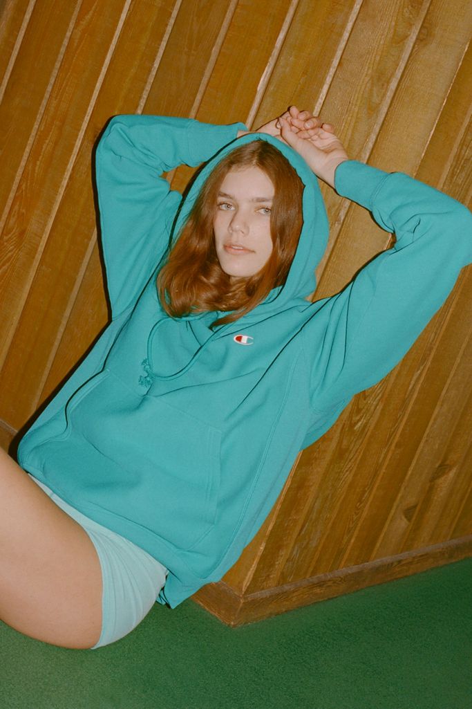
Millennial Pink, also known as “Tumblr Pink” and “Scandi Pink” is not the same as Barbie pink, which was the pink shade of the aughts. This was a softer, less aggressive shade….some considered it a modern take on the color.
New York magazine did an exhaustive, almost too dry article>> on the history of millennial pink citing here in a lot of her research. The New York Mag fashion editor Amy Larocca said, “often when Pantone declares Marsala Red or Radiant Orchid to be the next color to watch, we shrug knowingly, fully expecting to see that shade on shelves but not expecting it to invade our consciousness.”
But millennial pink was different...it really did invade every aspect of clothing, graphic design, interior design, product design….it became a signature of the “blanding” aesthetic (refer to our episode on Blanding for MORE!)
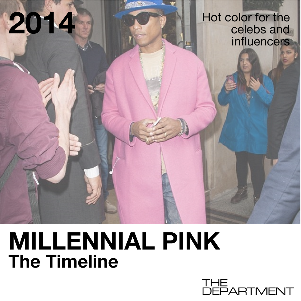
In November of 2014, the Color Marketing Group, a worldwide nonprofit color-forecasting group of which Pantone is a member, picked Shim, a deep pink-beige, as the 2016 emerging color (the group works two years in advance). It’s an early version of Millennial Pink. The Asia-Pacific members of the group are the first to notice the color and say that it represents a change in gender roles; the name Shim is a play on she and him. Mark Woodman, the former president of CMG, calls the color a “moment of quietude” and explains that “there’s so much stress that people think, What can I do in color and texture that I can take with me that gives me a moment to calm down?
That same year, #palepink is the top used pink-related hashtag on Tumblr...a place that virtually birthed the pastel aesthetic! And I would say that the kids of Tumblr really lead the this paste revolution with all of the pastel aesthetic blogs, pastel goth.
Every brand--whether it’s clothing, kitchen goods, furniture, you name it...has gotten into the millennial pink game at some point. ...but strangely none of the big car companies have? WHAT A MISS. Probably why Millennials aren’t buying cars! (please refer to our episode on Millenials Killing things ;).
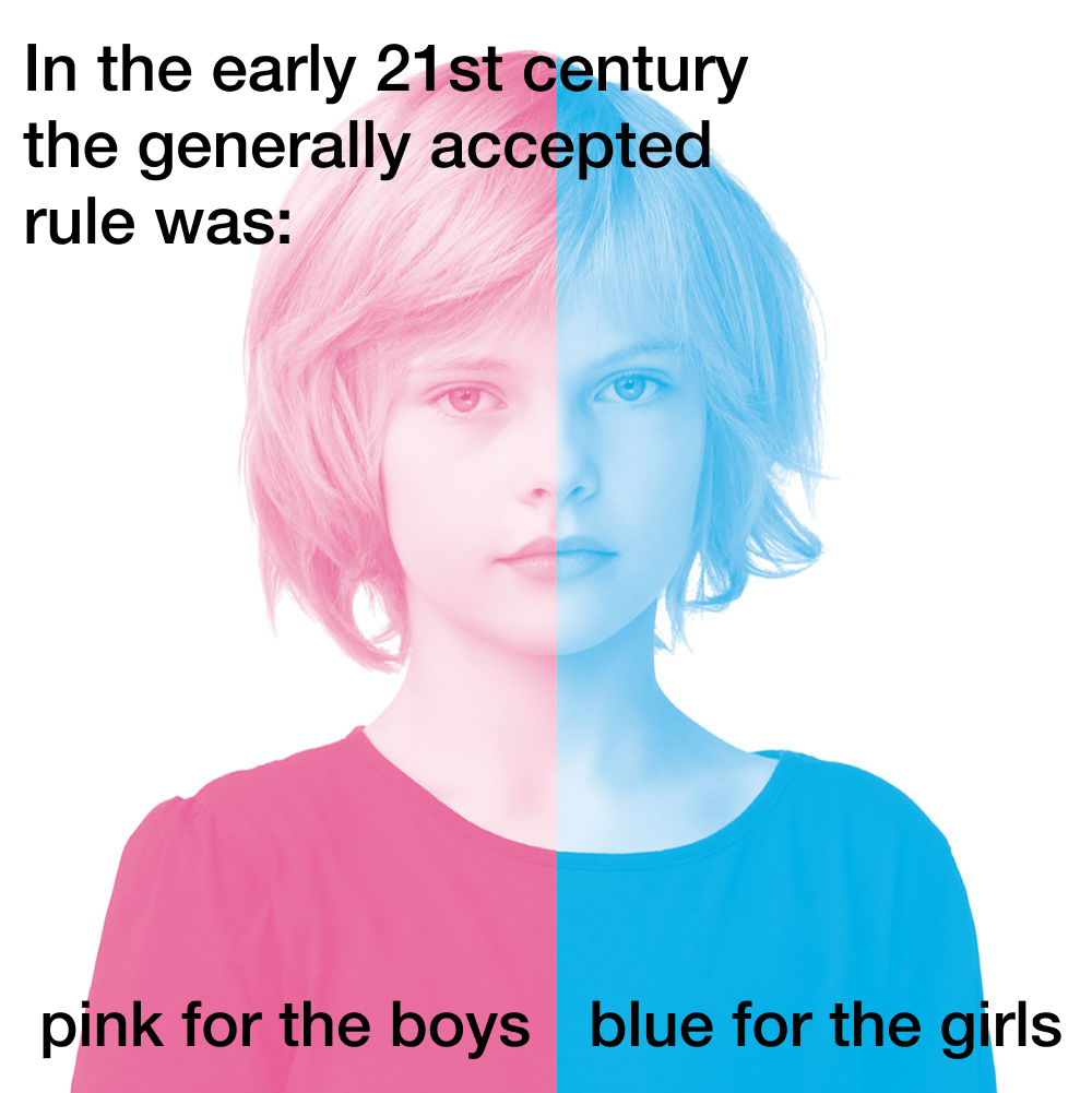
People would ask...why pink? A traditionally polarizing color!
In 1918, the trade publication Earnshaw’s Infants’ Department published an article saying, “The generally accepted rule is pink for the boys, and blue for the girls.”
Traditionally considered a color of our youth -or femme girl icons like Paris Hilton, Leagally Blonde or House Bunny - it became popular beyond age, gender or taste. Fuelled by nostalgia and trend the color took over in a massive way.
But millennial pink had a different, androgynous vibe. It was considered the “genderless mascot” of a generation. It’s also flattering and easy on the eyes, which doesn’t hurt!
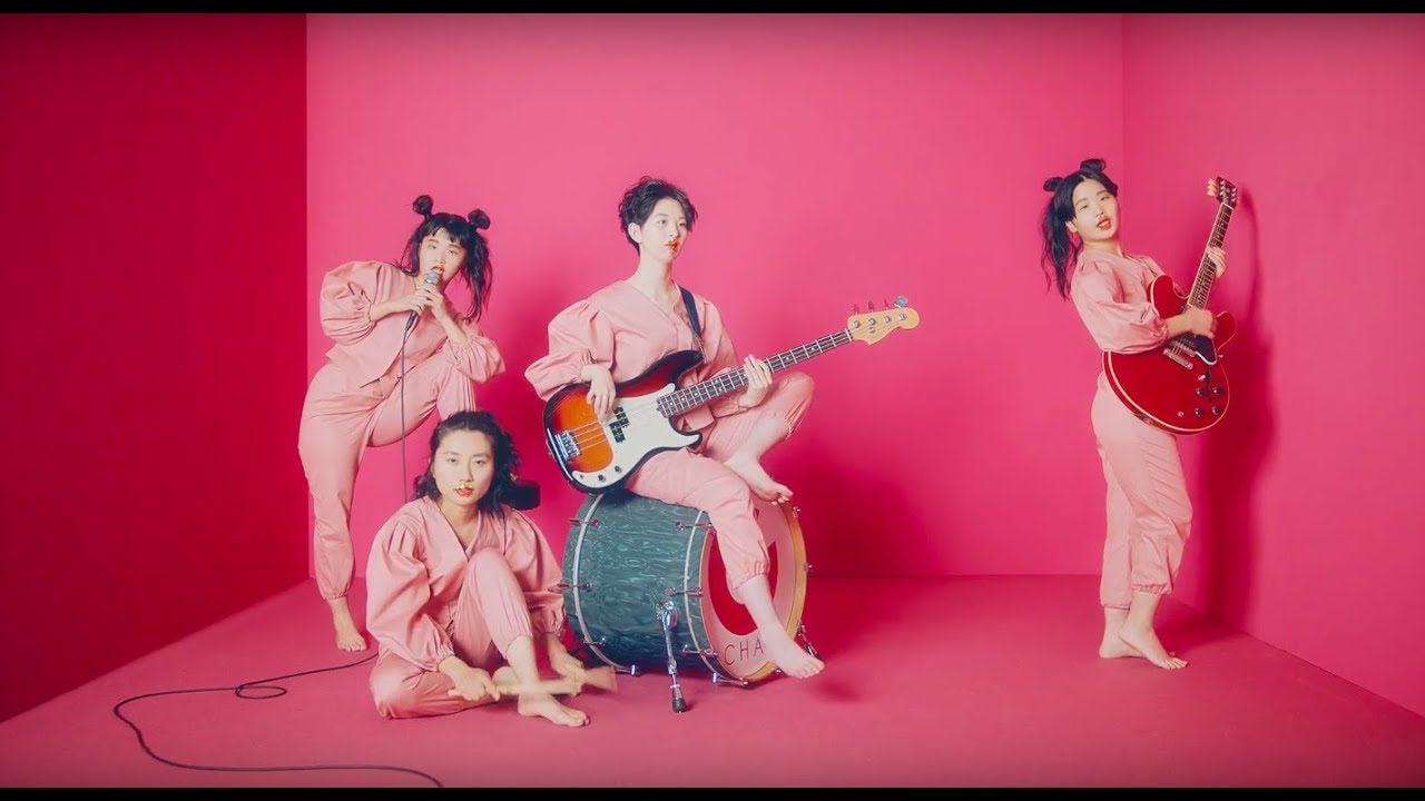
A few years ago Amanda read an amazing interview with one of my favorite bands, a Japanese girl band called Chai, who uses pink very heavily in its imagery and outfits! This quote from member Yuki really stuck with me: “In Japan, most girls like pink when they’re little. There is this cultural understanding that when you’re a young girl, you can wear pink, but as you grow older, pink is not the color for you. What we are trying to say is that pink is for everybody at every age. We wanted people to know it’s a cool color and it shows woman power. Our pink outfits show we’re not just cute: This is what cool women wear.”
While this shade of pink is not new, it’s invasion of our consciousness and our surroundings began in earnest in 2013...so Amanda wanted to call out some iconic millennial pink moments:
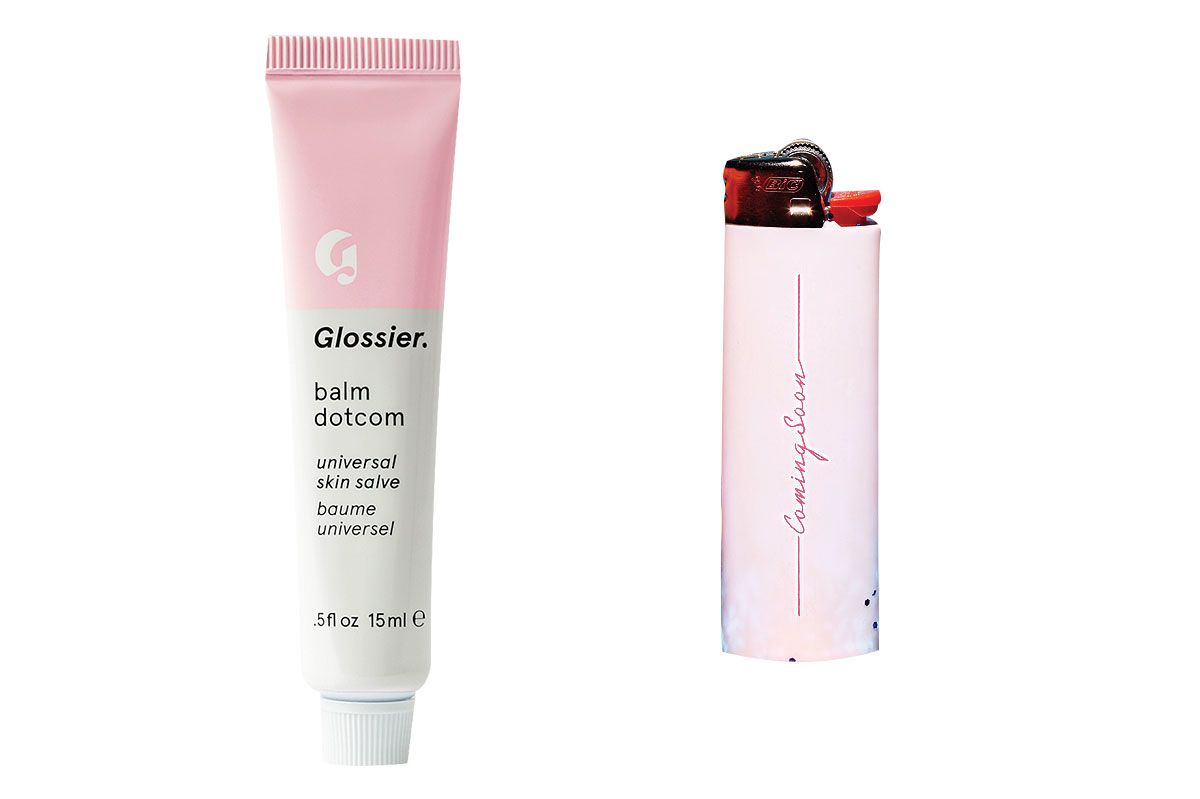
- Glossier! It’s packaging, it’s products, the jumpsuits that its employees wear in the flagship store.
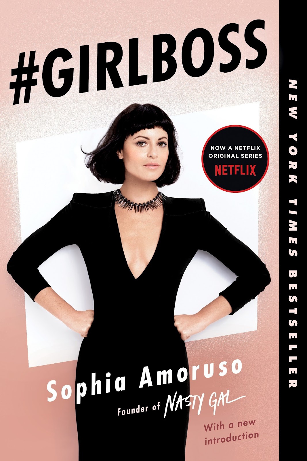
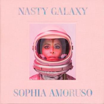
- The cover of Girlboss, Kim’s favorite book, and Sophia’s second book Nasty Galaxy
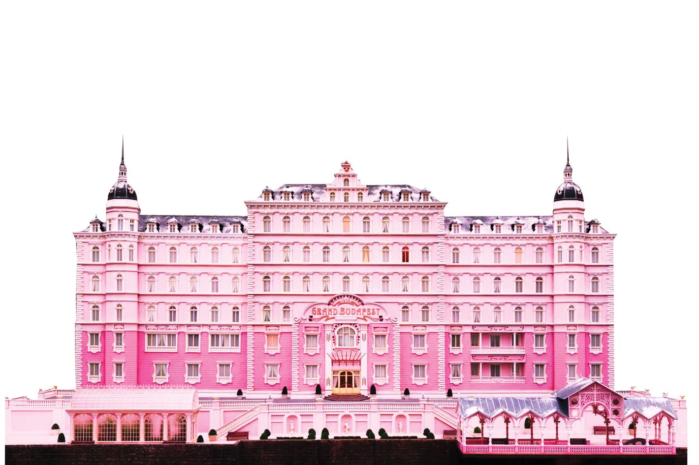
- The upper half of the Grand Budapest Hotel, the setting of the film by Wes Anderson
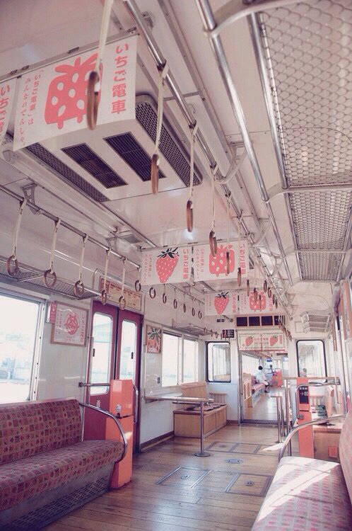
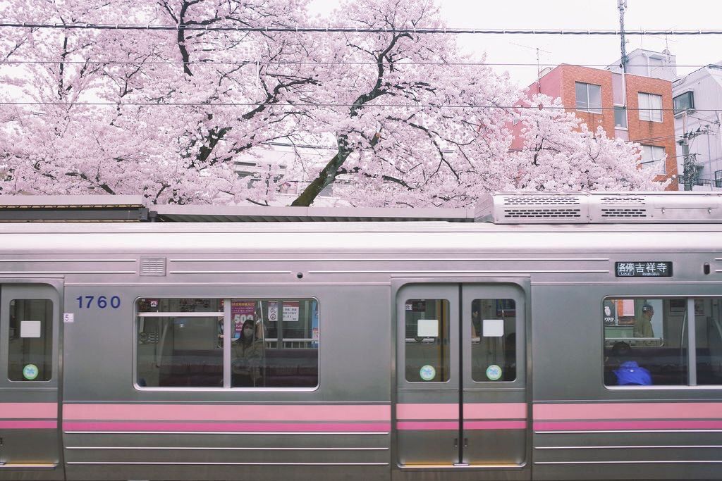
- Many subway cars in the Tokyo metro system are pink, sometimes to denote “women only” cars, but also just because science has proven that the color is so soothing to stressed out commuters. They also created special soothing music for each station for the same reason!
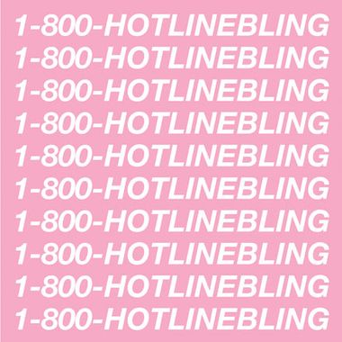
- The cover of Drake’s Hot Line Bling...which inspired so many graphic tee knockoffs!
- The Wing used it as the primary color for its locations
The Rise of Millennial Pink:
By December 2014: #palepink becomes the most popular pink-related tag on Tumblr. Users share about the color so often that it starts being referred to as “Tumblr Pink.”What got us to this point?
Referenced by Digiday


What colors do we see trending with Gen Z?
Gen Z Yellow was getting a lot of airplay in 2018 and a lot of people were hoping for another stand out color with the new generation that was swinging in with new market share and dollars at the ready. This year we see that the Pantone Color of the Year is in fact - Gen Z yellow. Will it eclipse Millennial Pink? Not likely!
Nostalgic colors: 90’s colors and Y2K is trending
- Billie Eilish makes a lot of moves with color choice and style The New York Times, called Billie Eilish Gen Z’s fashion role model, suggesting it’s the “new generation’s rejection of the flirty babe aesthetic in favor of something more crazily improvised and less strenuously sexual.” She embraces Neons like UFO Green against statement blacks
- 2000’s - on tick tock girls are recreating the look complete with butterfly clips and frosted lips.
- Seafoam / Aqua
- 90’s Pink - bubblegum
- Lavender
Kindercore
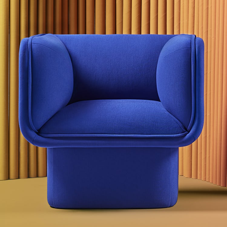
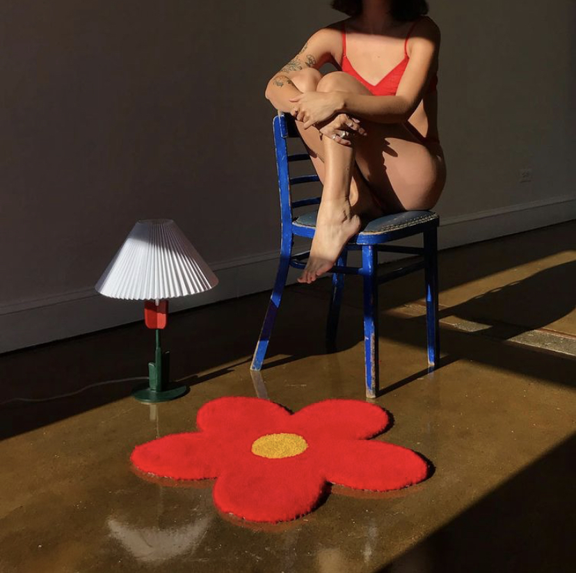
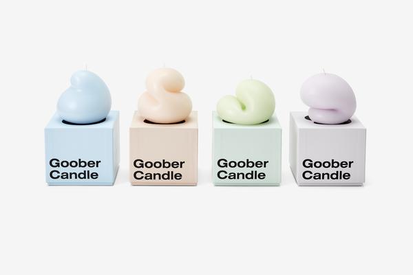
As we mentioned before whenever there is an existing mainstream trend, there is often a counter trend that will resonate strongly as people get exhausted by the status quo. So this minimalism trend of clean design and neutral color has been popular for years. As an opposing trend and one that taps into the zeitgeist to alleviate the darkness of the times, many designers from interior to fashion are turning to a movement called Kindercore. It is essentially a happier aesthetic rooted in primary & bubblegum colors, geometric shapes as well a new movement into fun squiggly shapes reminiscent of being a kid or in your kindergarten classroom. In general COLOR itself is trending more as mentioned as a macro trend toward Maximilizm is starting to counterbalance out the years and years of minimalism. Maximilism is trending like crazy right now with #masimalism having over 7.5 million views on TikTok.
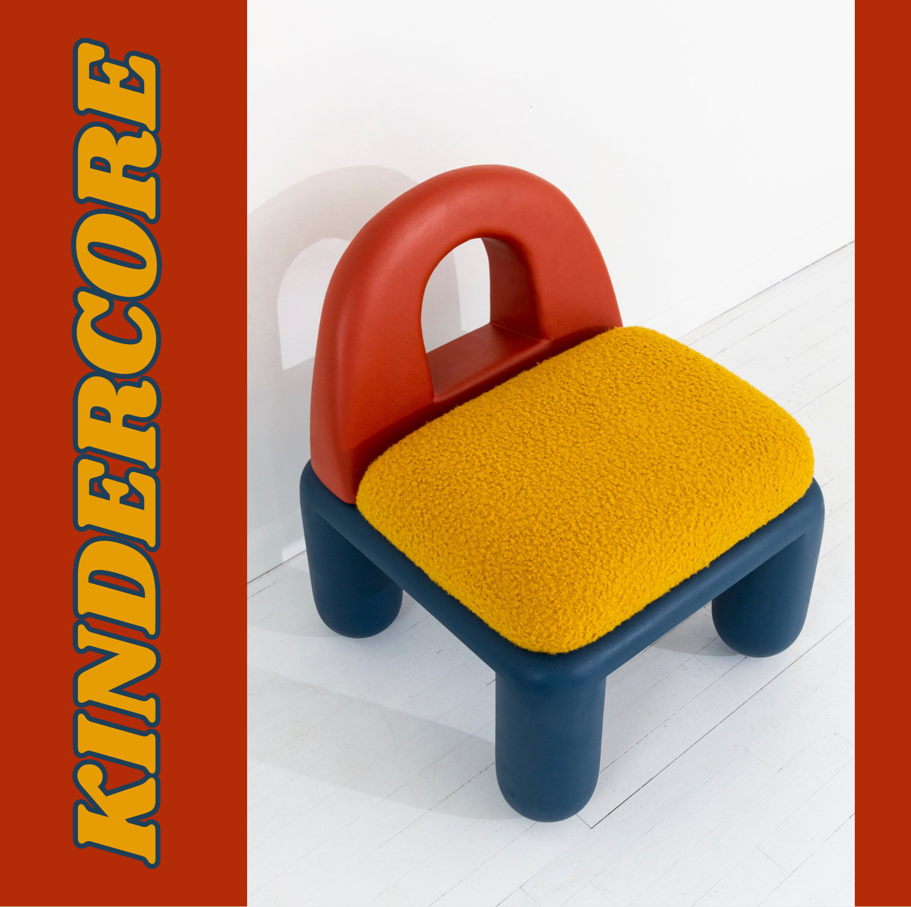

Kindercore plays on the design aesthetics inspired by Bauhaus, De Stijl and Memphis. We see it in various fashion - but it is most important right now in interiors and home goods. The clean lines of Midcentury modern will most likely always appeal and be “safe” - but this subverts that look. Chunky lines, chubby furniture and home goods, squiggles and extroverted color choices invoke a sense of carefree fun and wonder. Doing your whole space can be overwhelming but adding a few bold statement pieces make this trend consumer friendly.
According to an interview in NY Mag >> in Novemeber - Jill Singer, the co-founder of Sight Unseen, attributes it to the collision of three separate trends: Memphis Milano (which has reached something of a saturation point in recent months), maximalism (“it’s in”), and a renewed interest in primary-color-focused artists, like Calder and Hockney. “All of that,” she says, “combined with the fact that the news is depressing. So why not a rainbow?”
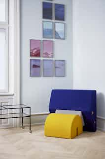


Wiggle Design Trend:
I argue that this awesome trend of Squiggly and globby things that are selling out everywhere should be included in Kindercore - the shapes referencing the same childlike abandon of shape is inspiring to people stuck at home - with a nod to Memphis design.

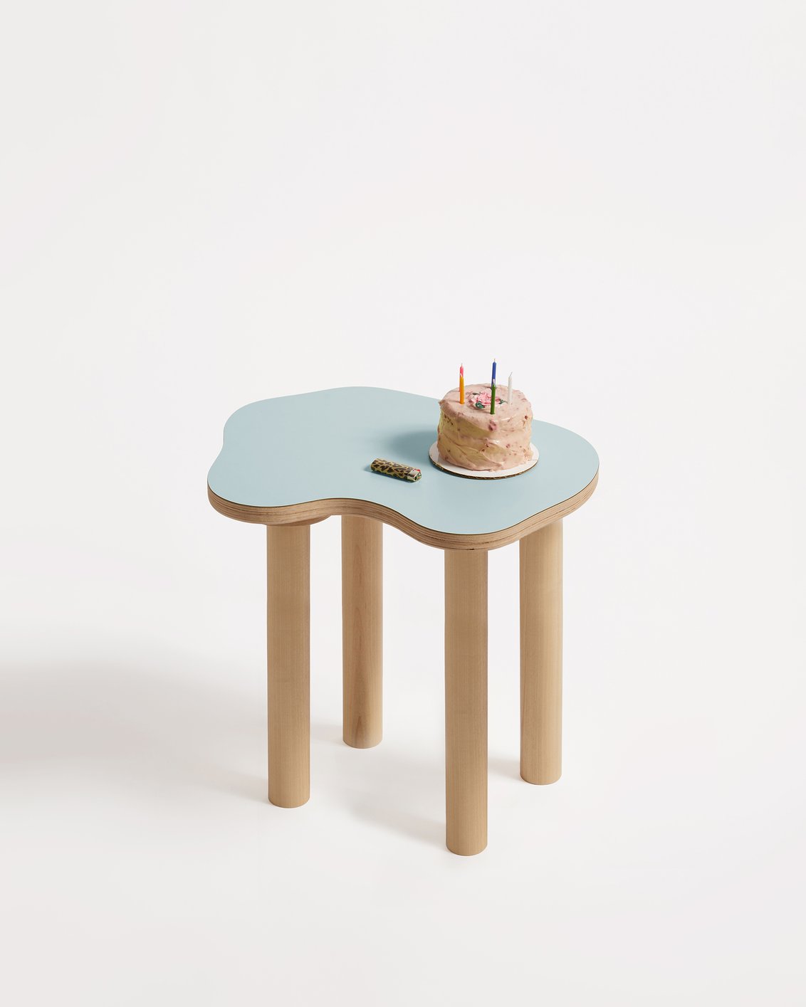
Wiggle Room >> - has these tables I have been obsessed with that have curvy shapes and amazing colors - they also do colored wiggly mirrors

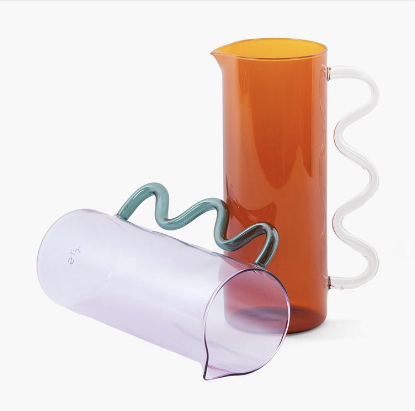
Slowdown Studios- playful home goods>>

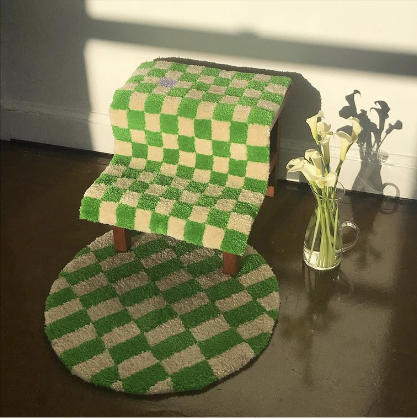
Pieces by Aesthetic pursuit - wiggly rugs & Tetris planters>>


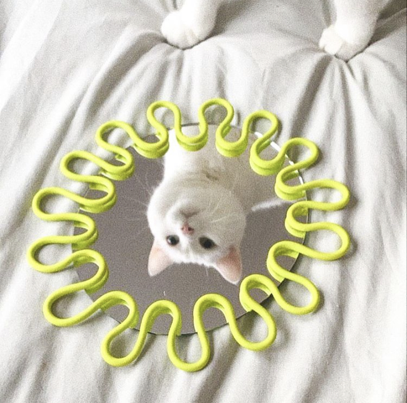
Lotta Blobs - wiggly mirrors>>
Made by Erica Studio - Rugs >>
Lolo Wiggle Hooks >>

2LG Studios>>


Talbot and Yoon>>
Chunks Hair Accessories>>
