
A podcast about trends and taste.
Departments
︎︎︎Episodes
︎︎︎About Us
︎︎︎Contact
︎︎︎Hotline ︎
︎ News Subscribe ︎︎︎
︎Listen
︎Follow
︎Rate
︎Review
A podcast about trends and taste.
Department
︎︎︎Episodes
︎︎︎Human Resources
︎︎︎Information Technology
︎︎︎Hotline ︎
︎ News Subscribe ︎︎︎
︎Follow
︎Rate
︎Review
︎︎︎episode 23
Color Trends (pt 1) Pantone: Clashing Colors, Considering the Color of the Year, Pantone & Pantyhose, Calvin Klein’s Coffee + Colorstrology
Jan 5th, 2021
︎︎︎︎ Listen on Apple
︎︎︎︎ Listen of Spotify
︎︎︎︎ Listen on Stitcher
Got a hot tip? ︎
Call our Trend Hotline hosted by sister podcast Clotheshorse ︎︎︎ 717.925.7417
Amanda and Kim explore the trends in colors and the key players behind them - most importantly Pantone and their Color of the Year.
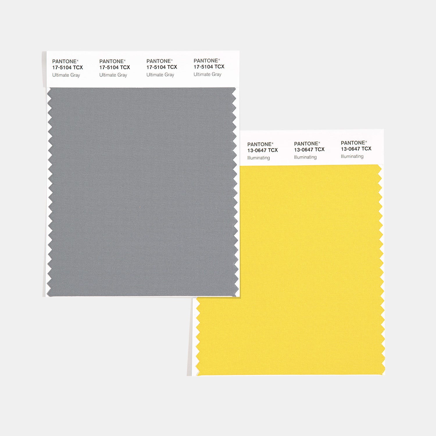
So the annual grand decree of Pantone’s Color of the Year for 2021 was released recently - For the second time since they started doing the Color of the Year Pantone released 2 colors. They have a bright yellow called Illuminating and a very basic stone grey called Ultimate Grey.
Pantone’s Color of the Year 2021︎︎
Essentially it symbolizes strength and hope - The Pantone website>> describes their selection as:
“Ultimate Gray and Illuminating are two independent colors that highlight how different elements come together to support one another which best expresses the mood for Pantone Color of the Year 2021. Practical and rock solid but at the same time warming and optimistic, the union of PANTONE 17-5104 Ultimate Gray + PANTONE 13-0647 Illuminating is one of strength and positivity. It is a story of color that encapsulates deeper feelings of thoughtfulness with the promise of something sunny and friendly.”
We find that these ‘Color of the Year’s’ have been following the trend - not leading it lately - Yellow has been trending for at least 3 years . In 2018 industry people proclaimed this yellow Gen Z Yellow which was pegged to usurp Millennial Pink which rocked the color world last decade. But this wasn’t always the case.
So all this talk begs to ask the question - What is the PANTONE Color of the Year?
Hall of Pantone Color of the Year 2000-2021
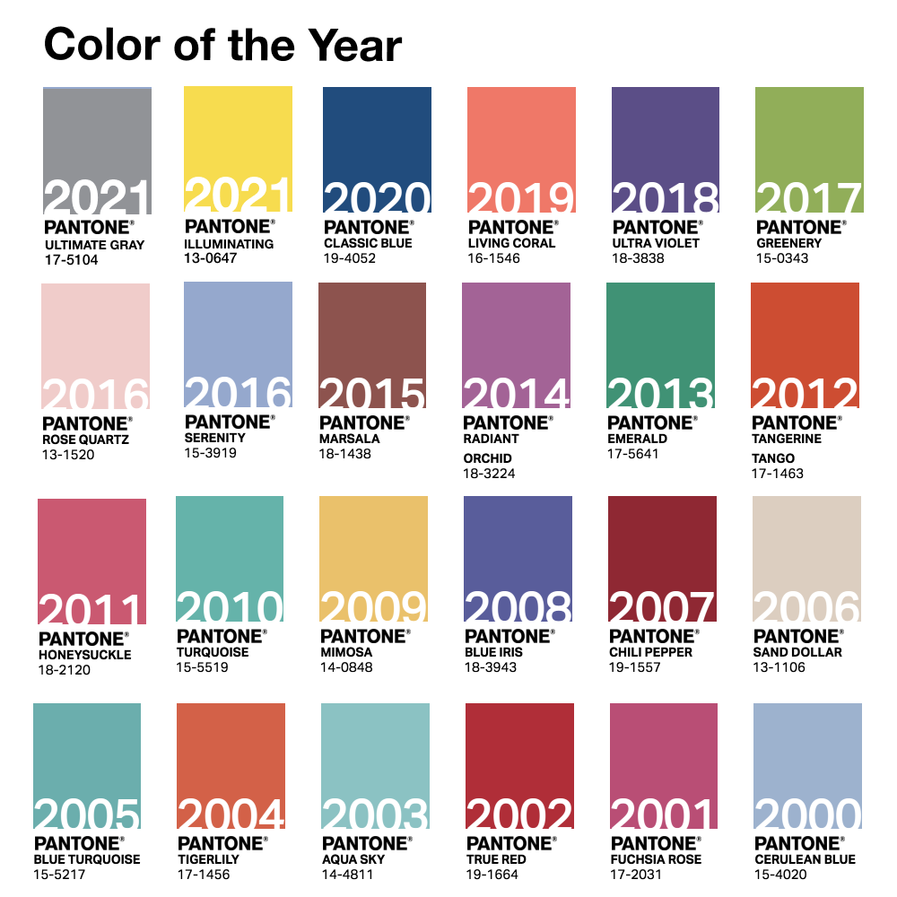
First and foremost the color of the year is meant to be aspirational as well as draw some pr momentum. Pantone has been doing the color of the year since 1999 - picking the color of the year for the next year - and set the precedent for a bunch of other paint and trend companies that also release their own color of the year. Color of the year started as a marketing tool to liven up the color standards business - put a little hype and serious pr spectacle into the game. Starting in 2000 the first official color chosen was Cerulean, a light blue said to capture the angst about Y2K- This color represents the millennium because of the calming zen state of mind it induces.
Since the founding Pantone has figured out how to capitalize on this more and more - they now enter into licensing agreements with various companies - from nail polish to hotel suites - so that the color is everywhere and these brands are on trend as well. So in essence it is a self fulfilling prophecy. Ultimately the color of the year and the colors they forecast for the season are really about selling merchandise and informing a similar palette brand’s use in unison to come together on a color trend. The more customers see a color the more they lean into it - essentially - so it is a catalyst for a color trend and makes them appear as a reliable resource.
Interestingly however - The colors are designed to create obsolescence - after a few months the color loses interest and is considered pase because it was last year’s color. Previous year’s Pantone-branded coffee mugs for example are often seen marked down. The annual update on iPhone colors for instance, is meant for consumers to covet a new phone every year.
Here is a great article: Why Does Pantone Choose a Color of the Year>>
Pantone Officially defines their choice and methodology as: “A symbolic color selection; a color snapshot of what we see taking place in our global culture that serves as an expression of a mood and an attitude. Trends across all categories and industries reflect the culture we live in. As marketers, our primary goal to be successful is to connect with people and to do that, it is important to be in touch with these trends.”
The Busines Insider came out with a compelling article this year after the 2021 colors were announced called ‘Pantone's Colors of the Year are intended to reflect 'resilience and hope' for 2021. But the annual decision also has a trickle-down effect on everything from high fashion to iPhones.’ by Avery Hartmans>>
Avery examines how Pantone's Color of the Year is meant to make a statement that they obviously serve another purpose: setting the tone for the consumer products industry and kick-starting a trickle-down effect that can last for years.
“Hartmans gives this reference - that Cerulean was the color of the year in 2000- then There's an iconic scene in the 2006 film "The Devil Wears Prada" that helps explain the color phenomenon. In the film, Anne Hathaway's character, Andy, quietly scoffs at two similar-looking turquoise belts someone had just described as being "so different." Andy's reaction leads Meryl Streep's character, Miranda Priestly, to turn on her and unleash a seemingly calm yet undeniably eviscerating explanation of the power of the fashion industry and its trickle-down effect on consumer products. To drive home her point, Priestly uses Andy's blue sweater as an example: it's not just blue, it's cerulean, and four years prior, designers Oscar de la Renta and Yves Saint Laurent had both used cerulean in their runway collections. The color then made its way through other designers' collections, into department stores, and finally into the average person's closet. "That blue represents millions of dollars and countless jobs," Priestly says “ - the same cerulean that 2 years prior was the chosen color of the year from Pantone.
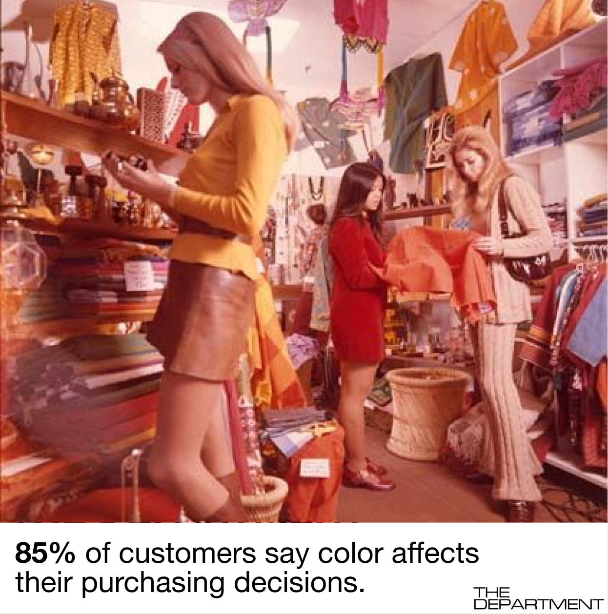
The Pantone Color of the year is determined by a top-secret group of industry experts, the annual selection is run by the consulting department known as the Pantone Institute. Months before the announcement, Pantone actually collaborates with various brands to unleash an avalanche of products in the exact hue they specify. No matter if that color is flattering or works in that product. Pantone is big business and here is why the 2015 Color Marketing Group survey found that 85% of customers say color affects their purchasing decisions.
Colorful Times We Live In ︎
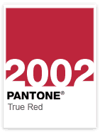
After the Septembr 11th attacks Pantone chose True Red in dedication of the event. It was a remembrance of the fallenn and courageous as chosen as a patriotic and powerful color. It was also a representation of love and something that Pantone believed was needed during this year.
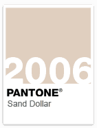
Sand Dollar was chosen to express concerns about the 2006 economy. As a warm neutral shade, it relaxes and soothes nerves because it reminds us of the desert and soft sandy beaches.
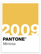
2009 we see glamorously named Mimosa to express hope, reassurance as well as optimism and innovation to counterbalance the economic uncertainty and political change.
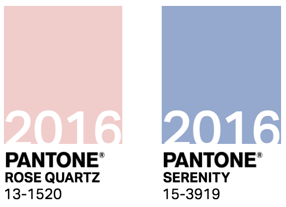
For the first time ever, in 2016 there were 2 colors chosen together as the color of the year. This choice coincided with the discussions of societal movements toward gender equality and fluidity. Also, the warm embracing rose tone and the tranquil blue reflected the need for connection and relaxation in turbulent times.

Coral was a hot color - a distillation of pink and really wearable. I saw this everywhere in the market a year or two before Pantone claimed it as a prophecy.

The 2020 Pantone color of the year is one of great controversy - it is just basic, what they call, “classic blue”. It was kinda like a what the fuck moment in the industry. It was just so - well, yeah, basic.
She goes on to say “Classic Blue is the color equivalent of watching Friends.” “Classic Blue” is as forgettable, as pedestrian, and as safe as a TV show about six people who all look alike. I’m not offended by “Classic Blue,” but I’m offended that Pantone has assigned it the vitally important role of ushering in a new decade, particularly one that follows a decade as tumultuous as the 2010s. “Classic Blue” feels aggressively 1997…. Pantone, the leading color trend and palate curation company since 1962, describes “Classic Blue” as “a timeless and enduring blue hue . . . elegant in its simplicity,” adding: “Suggestive of the sky at dusk, the reassuring qualities of the thought-provoking Pantone 19-4052 Classic Blue highlight our desire for a dependable and stable foundation on which to build as we cross the threshold into a new era…. To me, the hue calls to mind Facebook’s logo and my Google Docs icon. A vivid blue reminder of data surveillance and the tireless demands of work in 2019 doesn’t exactly soothe the soul.”
WGSN + Coloro Color of the Year 2021

AI Aqua ︎
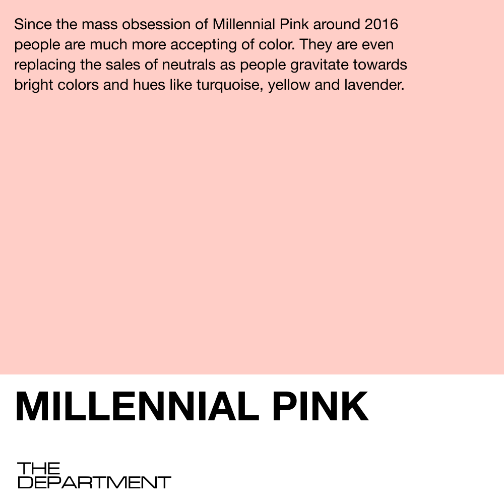
On an interesting note here - WGSN one of the largest industry trend forecasting companies - partnered with Coloro another color service like Pantone and their color of the year for 2021 is AI Aqua - they approach picking their color with slightly different criteria. They want a color that will be successful for their clients - so they do a lot of trend research to land on their color. According to an article in 2019 (they choose colors 2 years out to clients have time to develop into them) from Dezeen who spoke to WGSN about the selection of the colour>> is described by the brand as a "positive" hue, that is "both sporty and trend-forward". When selecting a colour, WGSN's research method involves examining significant developments within various industries as well as socio-economic conditions. WGSN's head of colour Jane Monnington Boddy told Dezeen. "Going forward, technology is only going to become a more integral part of our lives...The digital world will become faster, more efficient, and in turn we will become even more connected and aligned...When selecting AI Aqua, the team looked in particular at the arrival of 5G, which is being rolled out to devices this year and is set to be widely available by 2021.The team found that blue shades were popular for internet searches, and for the branding of tech companies.” Monnington Boddy was a designer in the 1990s and she explains that "Blue is a colour that has always been commercial in fashion – you always have to have blue in your palette..When she was a designer in the 1990s, she always had to include blue because it sold, but it was never pin-pointed as a fashion colour. Whereas now, it's coming through as a statement colour – the tone of Aqua AI is a lot more digestible for most people. They go on to say that since the mass obsession of Millennial PInk around 2016 people are much more accepting of color and even bright colors these days then in the past where neutrals and blacks were reigning supreme. Bright colors are optimistic and happy and consumers are craving more color during these last few turbulent years. In fact :"We've found that rather than replacing black – sales of which remain strong – these colours are actually taking some of the market share that was previously occupied by neutral and natural colours."
Pantone & Pantyhose
Amanda opens up the swatch book further to explore the story and history behind the famous Pantone - a staple tool in the fashion and design industry amongst many others.
From its original start in the 1950’s the company was originally M & J Levine Advertising out of New Jersey. The owners hired a visionary by the name of Lawrence Herbert in 1956 as a part time employee - with the job to systematize and simplify the company's stock of pigments and production of colored ink. by 1962, Herbert was running the ink and printing division at a profit...while the commercial-display division run by the Levin brothers was $50,000 in debt (which was about half a million dollars in 2021). Herbert purchased the company's technological assets from the Levine Brothers for $50,000 (paying off that debt) and renamed the company Pantone. He saw that the future was color and systemizing it, rather than just printing stuff.
One day in the early 60’s, while driving to work, Herbert was pondering a better, more consistent way to systemize color. You see, he had recently produced a display card for a pantyhose display, that was intended to help customers choose the right shades for them. This had been an arduous process, because there were no inks in existence at that point that matched exactly, and so Herbert had literally hand mixed all the colors to match each pantyhose swatch. At that point, there was no consistency between ink manufacturers, so you could order taupe or wheat from five different companies and receive five totally different colors. This led to a lot of this hand mixing and just wasted time.
The solution--as far as Herbert saw it--was to create a numbered system. Herbert said:
“If somebody in New York wanted something printed in Tokyo, they would simply open up the book and say, ‘Give me Pantone 123,’123 (a daffodil yellow) would look exactly the same the world over. Herbert created a sample page to show how the system worked and sent it to ink makers. He still owns a copy of that page!
By the 1970s, Pantone was making more than a million dollars a year off of licensing its color system, called the Pantone Matching System, also called unfortunately PMS. Pantone has formulated 1867 colors for graphic designers who create logos, print publications, and product packaging. There are 2,310 Pantone colors for fashion and interior designers.
And while the Pantone system was originally intended for advertising, it has been adapted for food science, plastics, paints, textiles...even some stranger uses:
It was used to define the color of a Ben + Jerry’s brownie--to ensure consistency in ice cream production.
“I have matched color charts for wine,” Herbert said. “I matched color charts for anemia blood samples and for walnuts and strawberries and goldfish.”

Calvin Klein kept a Pantone chip in the kitchen to signal to his chef what color he wanted his coffee to be.
Tiffany & Co.'s iconic robins-egg blue is actually PMS number 1837 (the brand's founding year). Pantone created the custom color for the brand, which is trademarked and not available in any fan book. It remains one of the most well-recognized brand-color associations in the world.
Having a brand-specific color...especially developed by Pantone must cost a fortune, but studies have indicated that color is very important to customers when making decisions! From Secretariat of the Seoul International Color Expo 2004
- 92.6% said that they put most importance on visual factors when purchasing products. Only 5.6 percent said that the physical feel via the sense of touch was most important. Hearing and smell each drew 0.9 percent.
- When asked to approximate the importance of color when buying products, 84.7% of the total respondents think that color accounts for more than half among the various factors important for choosing products.
Starbuck's green, the Hermes orange, the red on the sole of Christian Louboutin, and Coca-Cola's red are all Pantone customized colors under trademark protection
The Pantone People

Only five people in the world have ever had their own Pantone colors:
- Jay-Z: pearlescent blue,
- real estate CEO Sherry Chris: a bright pink,
- fashion designer Jason Wu: grey,
- the late British fashion designer Richard Nicoll: an elegant blue,
- Prince: Love Symbol #2
For all of you fans of The Crown: Working with ad agency Leo Burnett, Pantone released a limited edition color guide inspired by Queen Elizabeth's "fashion-forward colour statements" to celebrate the monarch's 60-year reign--her diamond jubilee--in 2012. The palette highlights Her Majesty's love of monochromatic dressing.

Minions Yellow: For the release of the Minions movie in 2015, Pantone partnered with Universal Pictures to create an animated character-inspired color -- its first release in three years. The chosen hue is meant to exude “hope, joy and optimism.”
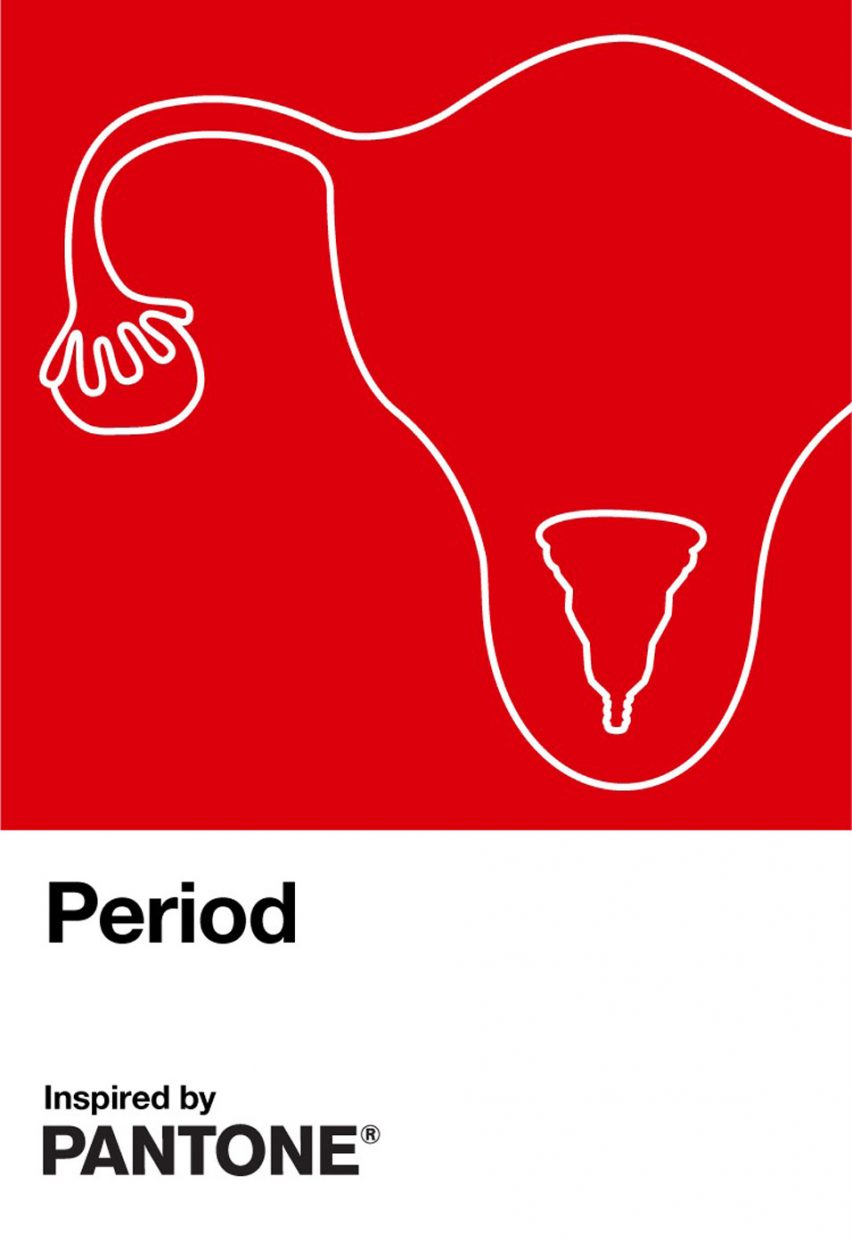
In 2020, Pantone partnered with health brand Intimina to create an "active and adventurous" red colour to start a positive conversation around periods. The blood-red hue is presented on a Pantone-branded card with an outline of a womb and ovary with a menstrual cup inside.

The pantone library is constantly evolving--especially as technology around producing color and materials changs--in 2020, Pantone added 315 colors to its library
There are over 50 new shades of pink, a colour that the brand believes has "embraced new meanings and relevance beyond it's traditional gendered and child-like status". Among them are First Blush, Viva Magenta and Tender Touch.
More than 70 new blues will also be available. Some of the cooler hues, like Frozen Fjord, nod to icy natural landscapes, while brighter, green-infused shades like Exotic Plume and Gulf Coast are meant to evoke a more summery, tropical feel.
Some of the added shades – such as Weathered Teak and Island Fossil – are supposed to offer a nuanced take on neutrals and taupes, which Pantone thinks are "too often seen as a single colour" but can offer "endless subtleties".
Meanwhile, I found this comment on an article about the new colors that I must share, from a user named “Geobob,” (his avatar is a jester): I'm sure designers have been waiting for all these shades with baited breath. But it brings to mind the famous scene in the 1948 film Mr Blandings Builds his Dream House, where Myrna Loy spends ages explaining the subtle colour scheme she wants - "...a soft green, not as blue-green as a robin's egg... not just yellow, a very gay yellow ...etc etc". Only for the decorator to declare that he got it - "Red, green, blue, yellow, white."
X-Rite, a supplier of color measurement instruments and software, purchased Pantone for $180 million in October 2007
- Industrial conglomerate Danaher Corporation paid $625 million to acquire X-Rite in 2012, Danaher is a mega company that primarily owns health and science related brands.
- Now, selling books of color chips is a massive business. Pantone recommends that designers replace color specimen books annually...which in my experience, doesn’t really happen because the books are SOOOO expensive
- A complete set of color specification books for graphic designers costs $1,620. You can tear little perforated chips out of this book to share with vendors and designers
- fashion designers pay $7395 for a Pantone cotton swatch library
- The wand is the budget version...nothing to tear out and share here, but at least you can share the number of the shade, and that’s about $300. I actually had a job where I had to pay for this out of my own pocket and it was painful!!!
- Because the current owner of Pantone isn’t publicly traded, we don’t have a view into how much the brand makes every year...BUT we can assume it’s a lot, because Pantone has shifted from being a tool and a name recognizable to designers and industry insiders, to a virtually household name through big name collabs and the “mainstreamification” of design and aesthetic (think of magazines like Dwell, or Tumblr, Pinterest,)...this combination has made Pantone a big brand!
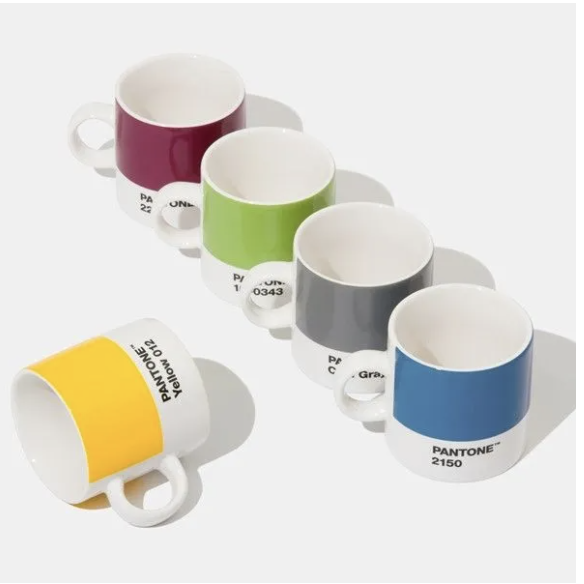
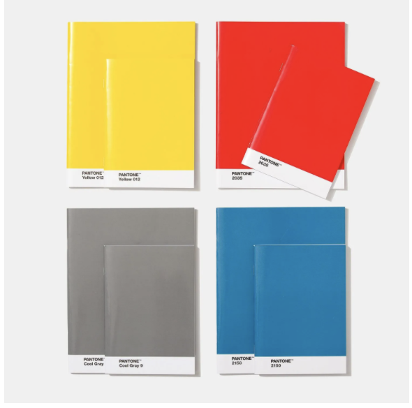
Pantone Products
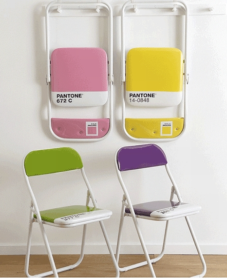
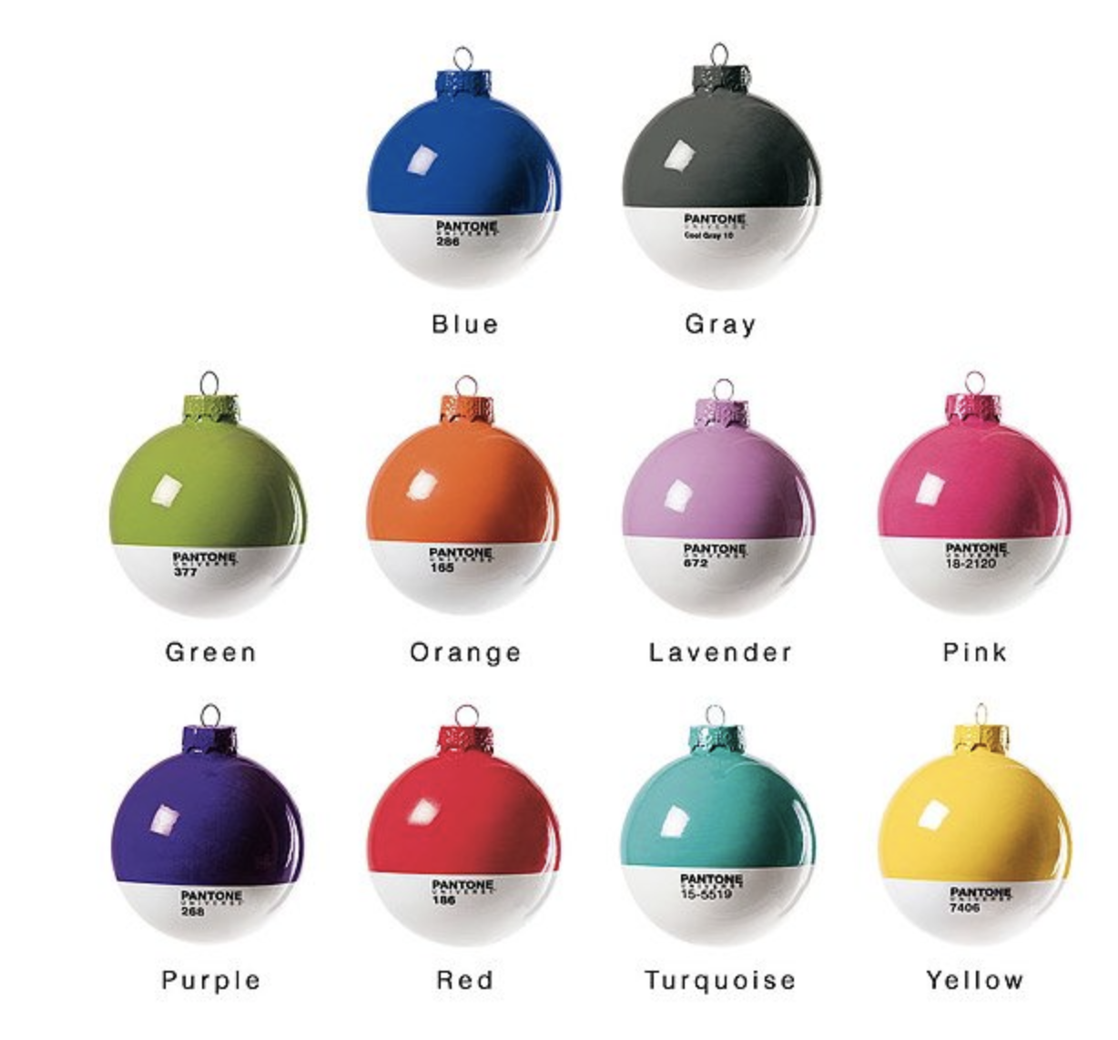
Amanda reviews some of the Pantone branded products like Folding chairs, ornaments, mugs, notebooks, iphone cases, passport cases, children’s books...pantone has made it all over the years. You can find some of it on their site under “pantone lifestyle.”
SEPHORA + PANTONE UNIVERSE

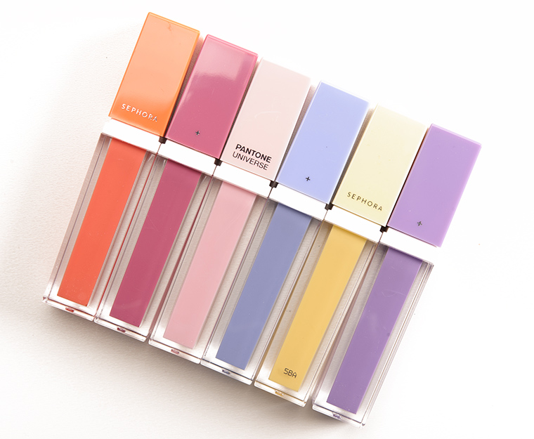
The first SEPHORA + PANTONE UNIVERSE collection was released in 2011 with Tangerine Tango. It was a huge hit, and paved the path for many successful collections. 2018 may have been the last year of the collab (it is hard to find answers) but after a few years of some really difficult cosmetic colors the union ran its course.
Colorstrology

Colorstrology: What Your Birthday Color Says about You
Michele Bernhardt, a healer and metaphysician, wrote Colorstrology, which blends astrology, numerology, and color theory to define a person's birthday color and align it with a specific Pantone color.
From the official description :Written by renowned astrologer Michele Bernhardt using the numbers and color schemes of Pantone, Inc., the global authority on color, the system features 366 “birthday colors” that illustrate who we are and how we behave. Using Colorstrology, you’ll quickly understand how to enhance your best personality traits with your birthday color.”