A podcast about trends and taste.
Departments
︎︎︎Episodes
︎︎︎About Us
︎︎︎Contact
︎︎︎Hotline ︎
︎ News Subscribe ︎︎︎
︎Listen
︎Follow
︎Rate
︎Review
A podcast about trends and taste.
Department
︎︎︎Episodes
︎︎︎Human Resources
︎︎︎Information Technology
︎︎︎Hotline ︎
︎ News Subscribe ︎︎︎
︎Follow
︎Rate
︎Review
︎︎︎episode 16
I’m with the Bland: How generics became cool again. Millennial Minimalism Movement, Naming Paradigm, History of Generics, The Great Generic Paradigm
Nov 17, 2020
︎︎︎︎ Listen on Apple
︎︎︎︎ Listen of Spotify
︎︎︎︎ Listen on Stitcher
Amanda and Kim spice up the trending dialogue around Blands! A concept being gossiped about regarding VC backed disruptor brands who share monotonous san-serif “blanding” across identity, voice, naming, logo and visuals.
Kim gets into the backstory of Blands causing quite a stir in the industry particularly in 2020’s Bloomberg article by Ben Schott Welcome to Your Bland New World - “Why do disruptive startups slavishly follow an identikit formula of business model, look and feel, and tone of voice? Because it works, sort of.”>>

image courtesy of Bloomberg - Welcome to Your Bland New World
Following the success of Warby Parker - it seems that VC kids demanded more, more, more (of the same, same, same) causing the blandification of the market and brands therein.
Kim makes some very valid points however about this concept:
- This isn’t a new concept. The chatter started 2018 with a Fast Company article: “The hottest branding trend of the year is also the worst - Is your made-up name rendered in a sans-serif type, with thiiiiiiiis much white space? Congratulations! You are a bland.”>>
- Minimalism has been trending hardcore for well over 10 years - and when these original VC disruptor trends started Minimalism was actually fresh and new to the Millenials these brands were geared toward. Coined here as the Millenial Minimalism Movement.
- Branding Agencies develop the most of the branding for these Blands - and its usually the same agency - actually 3 VC backed agencies: Gin Lane, Red Antler and Parters & Spade that specifically cater to that precious Millennial look and have built billion-dollar businesses over and over again. As Gen Z continues to grow to have more spending power we will start seeing a shift in aesthetics to cater to this much different demographic (think the rise of unique and maximal brands).
What makes a Bland a Bland?

Well, first things first - gotta go with the NAMING! Blands names are notoriously carbon copy namers and rely on similar naming tropes (as described from the Bloomberg article):
- Quirky or Naive names: Judy, Floyd, Billie, Henry, Maude) or “studiously cool” like the Jack Kerouac based Warby Parker.
- Portmanteaus: Hungryroot, Baublebar, Tracksmith, Trubrain, Classpass, Platejoy
- Color+Noun: Blue Apron, Black Milk, Purple Carrot, Green Chef
- Monoliths: Public Goods, Ministry of Supply, Primary Goods, Modern Citizen
- Vowelessness: RMDY, MVMT, DSTLD, HVMN, TRNK, MNDFL
- Ampersands: Tuft & Needle, Frank & Oak, Hook & Albert, Loom & Leaf
- Quirk: Lemonade insurance, Kangaroo home security
But for anyone who hasn’t named a brand - Naming is super tricky and kinda a science. Beyond just liking a name there are logistical reasons behind some of the naming decisions behind brands.
- First - registering for a trademark is really hard - so usually the name has to be very original and why you see so many made-up names.
- Second - SEO - your name has to stand out - and you don’t want to compete in search ranking. Like you start a Sneaker company and want to call it Runner’s Club - try googling that! The same goes for registering for a website! Hence the trend behind other domain names than .com becoming normalized (i.e. thedepartment.world)- it’s really hard to get a website unless you have a very original name.
- Listen in for a very special discussion about the White Claw name as well!
Once the name is settled - ditch the logo - Fonts and Typefaces are all you need (san-serif if you please) .
Bland logos are confident but cute, utilizing an array of tweaks and twists to provoke the all-important “smile in the mind.”
Said “smile in the mind”:
Then move onto visuals - which is descripbed as rather neutral, simple and looooooots of white space. They are generic for the sake of inclusivity.
Which is understandable why - these VC backed companies don’t want to alienate anyone and remain neutral for the sake of acquiring the largest market share. It is a comercial approach and It is a safe approach. But it makes them particularly generic - beause there isn’t much of a point of view.
How do brands avoid become Bland Casualties?
- Easiest one? Minimal Branding OUT - Maximal branding in!
- Risk it to stand out
- Cultivate a true Point of view
- Engage with an outside the box or newer branding agency
- Niche but make it nice
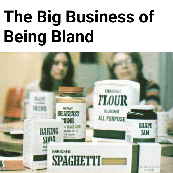
The Rise of Generics
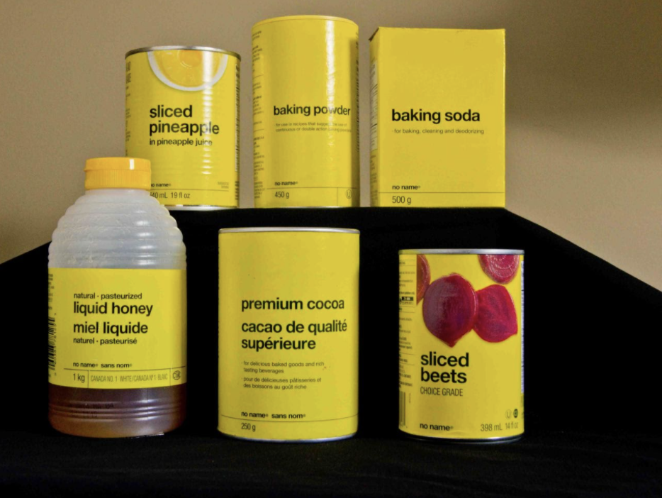
Amanda takes us back to simpler times and discusses the evolution of the generic 1970’s supermarket brand that has evolved over the years. In particular, No Frills grocery store founded in 1978 that took a page from the French generic brand Carrefour who saw extreme popularity in their minimal branding approach to discount and value groceries. At No Frills nothing was branded (although it could be argued that No Frills and their No Name was essentially a brand) with plain canary yellow packaging and simple san serif font spelling out the contents of the packaging. No Frills took a stand: forget the brand, focus on what’s inside, and save lots of money. Their quest for minimal packaging came from the concept that it conveyed a sense of thriftiness and value...that a savvy shopper might not have a lot of money but knew that it was what was inside the package that counted.
Listen and learn
99% Invisible ︎︎︎No Frills Podcast Episode
Watch and learn
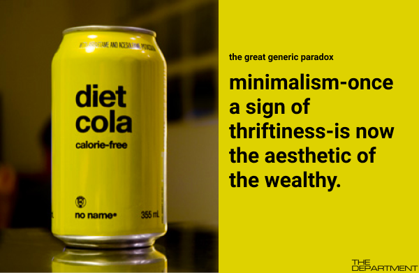
Here comes The Great Generic Paradox:
Minimalism once a sign of thriftiness - is now the aesthetic of the wealthy.
Ian Sevenious wrote a great essay a few years ago taking on Apple as part of this idea of minimalism being an aesthetic owned by the wealthy. The basic premise was: poor people can’t afford to be minimalist because they need stuff to survive.
Power to the Pack Rats
by Ian Svenonius:“The Apple proposition is a 1960s futurist-zen minimalist throwback, lifted from Nordic designers like Panton and Saarinen, whose functionalism was influenced by movements like De Stijl and the Bauhaus.
While modernism proposed ways of dealing with the cataclysmic upheaval brought on by industrialism, Apple’s proposition is the Western capitalist commercial: freedom, ease, and cool control of one’s environment.”
Amanda unpacks this further by considering that this idea of taste being good or bad, these “tastemakers” always being incredibly privileged in terms of looks, finances, and background...they get to determine what is good taste versus bad taste. And the ultimate things that are adopted by the wealthy, beautiful, famous and important are “good taste” and the things that are liked by everyone else are bad taste. So basically, talking about taste is just a more socially acceptable version of classism. And so right now we think minimalism is “good taste,” but only because the gatekeepers have decided that.
You will see in the story of No Frills, that eventually this minimalism became “bad taste.”
Dave Nichol, the owner of Canadian store chain Loblaw--which btw was struggling during the economic downturn of the mid-to-late 70s--saw what Carrefour was doing with packaging, and he wanted to adapt it for a Canadian audience. But he wanted this new brand--No frills--to be a brand with a capital B...with a very identifiable and iconic look and feel. So he brought in legendary Canadian graphic designer Don Watt. He created the iconic yellow color and paired it with the strikingly minimalist Helvetica font. Essentially creating a “brand”.


As time passed and we moved into the gregarious ’80s this minimal aesthetic started to become synonymous with “cheap” and “poor” and all marketing and branding took a 180.
This concept of “Generics” has evolved over time and as you found from the earlier part of the episode became the style de jour for Millenials. We see the look as cool and aligned with Helmut Lang>> when it was at it’s lowest point and brought back into the fold. Embraced by Muji>> as a generic “brandless concept” as well as many other Blands now at the center of millennial marketing.